What are User Interface Design Patterns?
If you are a web or app designer, you know that UI or user interface design patterns are an important part of the process. But what are they, and how do you use them? In this blog post, we will answer those questions and more! We will discuss user interface design patterns, why they are important, and how to apply them in your designs? So whether you are just starting in the world of user interface design or looking for new ways to improve your work, keep reading!
User interface design patterns are reusable techniques to deal with common user interface issues and difficulties. They are not specific to any industry or software application – you can find them being used in everything from websites to mobile apps to desktop applications. And because they are so widely applicable, user interface design patterns can be a great way to improve your designs, no matter what type of user interface you are working on.
Why are User Interface Design Patterns important?
There are a few reasons why user interface design patterns are so important.
- First of all, user interface design patterns can help you save time while designing the website. Using a UI design pattern that has already been created and proven to work, you can avoid starting from scratch every time you need to solve a common UI problem. This can help save time, especially if you soon have a deadline to meet.
- Another reason user interface design patterns are essential is that they can help you create a more user-friendly interface. Using patterns that have been tested and proven to be effective, you can avoid common user experience (UX) problems like confusing navigation or unresponsive buttons. This can make a big difference in how users perceive and interact with your interface, crucial for any web or app design.
User Interface Design Patterns
There are hundreds of different user interface design patterns out there. But which ones should you use in your work? To help you out, we have compiled a list of the top ten user interface design patterns that we think are essential for any designer to know.
Pattern #01: The Hamburger Menu
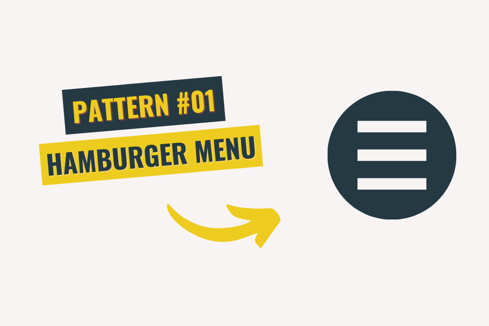
The hamburger menu is a popular navigation pattern used in many different types of interfaces. It is characterized by a three-lined icon (aka the “hamburger”) usually placed in the top-left or top-right corner of the screen. When clicked, this icon expands to reveal a hidden menu of navigation options.
This pattern is widely used because it effectively saves space on small screens, like mobile devices. It also allows users to access the navigation menu without leaving the current screen, which can be incredibly user-friendly. However, it is vital to use this pattern sparingly, as it can confuse users if overused.
Pattern #02: The Search Bar
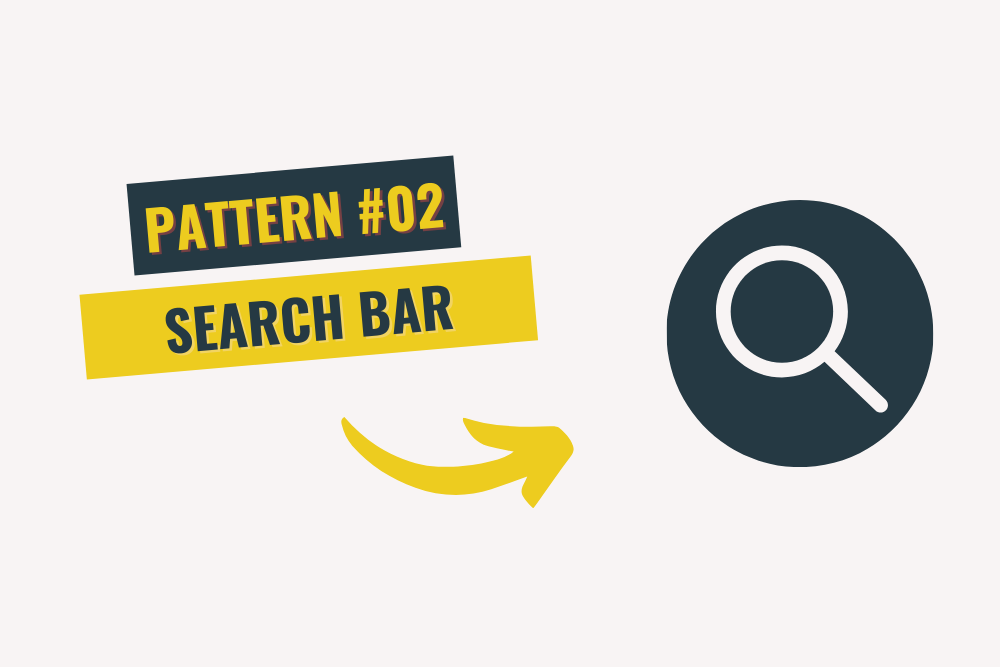
The search bar is one of the most common user interface design patterns. This one is pretty self-explanatory – it is a bar that allows users to search for specific content within an interface. This pattern is often used on e-commerce websites, as it will enable users to quickly and easily find the products they are looking for.
Search bars can be placed anywhere within an interface, but they are usually found near the top of the page. They typically include a text field for users to enter their search query and a button to submit the query. Some search bars also have additional features like advanced search options or autocomplete suggestions.
Pattern #03: The Carousel
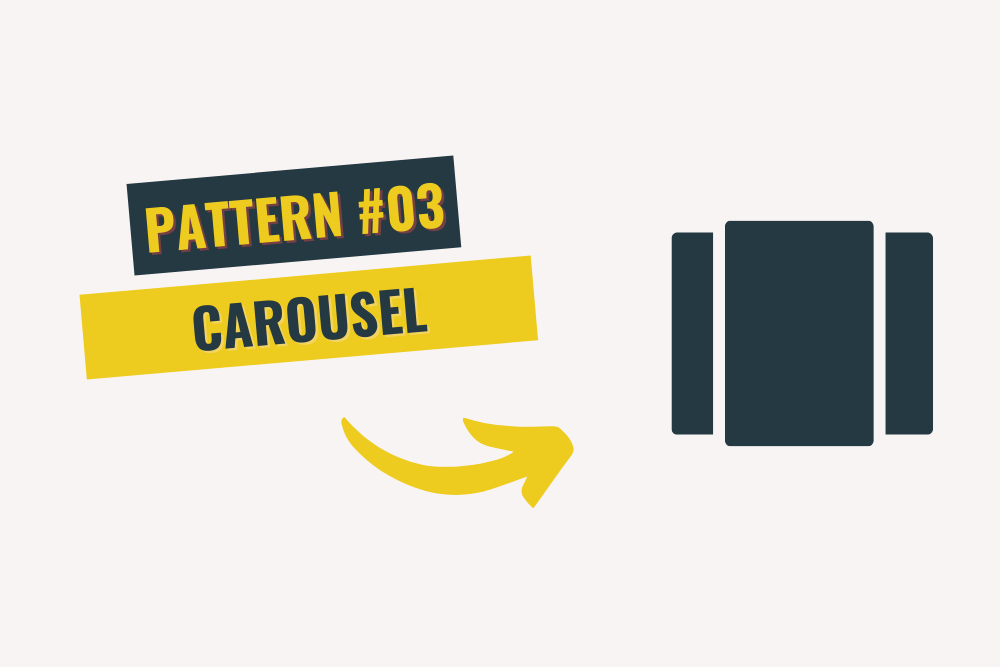
The carousel is a slideshow-like UI design pattern that is often used to display images or other types of content. This pattern is characterized by a series of “slides” that users can scroll through, usually with arrows or dots representing the number of slides on the site and which slide is currently in use by the user.
Carousels are a popular choice for image galleries, but they can be used to display any content, from articles to product descriptions. However, one disadvantage of this pattern is that users can easily lose their place if they scroll through the carousel too quickly.
Pattern #04: The Infinite Scroll
The infinite scroll is a UI design pattern that allows users to load new content as they scroll down the page. This pattern is often used on social media websites and other types of content-heavy sites, as it allows users to keep consuming new content without having to click through to different pages.
One of the limitations of the infinite scroll is that it can be easy for users to lose their place. Another downside is that it can put a strain on your server if too many users are trying to load new content simultaneously. However, this is a very user-friendly pattern that is very high in demand these days.
Pattern #05: The Card Layout
The card layout is a type of UI design commonly used to display articles or other pieces of content. This pattern consists of “cards” that contain the title, image, and a brief description of the content. Cards are usually arranged in a grid, and users can scroll through them to find something that interests them.
Card layouts are popular because they are easy for users to scan and consume. They also work great on mobile phones and other small devices, as they are easy to swipe through. However, one disadvantage of this pattern is that it can be challenging to fit much content onto a card without making it look cluttered.
Pattern #06: The Masonry Layout
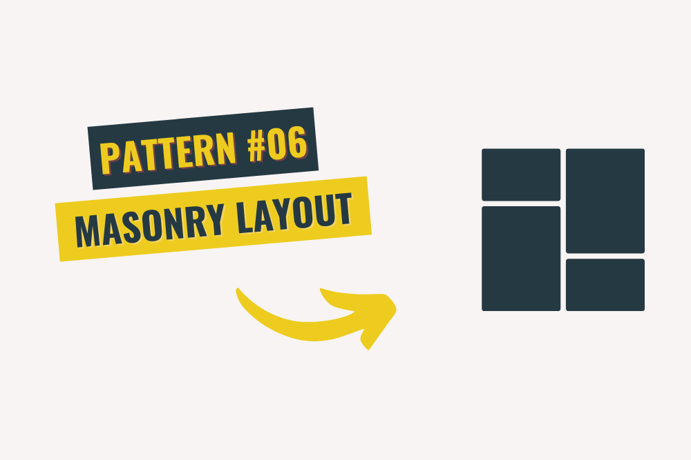
The masonry layout is similar to the card layout, but instead of being arranged in a grid, the cards are stacked on top of each other like bricks in a wall. This type of layout is often used for image galleries or different types of content that can be displayed in a grid.
Masonry layouts are popular because they are easy to browse and consume. They also work well on mobile devices, as users can scroll through the content without clicking through to different pages. However, one drawback of this pattern is that it can be challenging to fit a lot of content onto a page because too much content will make it crowded. In addition, a cluttered web page gives a bad impression of your website and isn’t user-friendly.
Pattern #07: The Pagination
The pagination is a UI design pattern that allows users to navigate through content by clicking on numbered pages. This pattern is often used for articles or other pieces of content that are too long to fit on one page. It is also common for eCommerce websites, as it allows users to browse through a large number of products clicking through different pages again and again.
Pagination is a user-friendly way to navigate through content. However, one downside of this pattern is that users can easily lose their place if they click on the wrong page. Another limitation is that it can take longer for users to find what they are looking for if the content is spread out over multiple pages.
Pattern #08: The Tabs
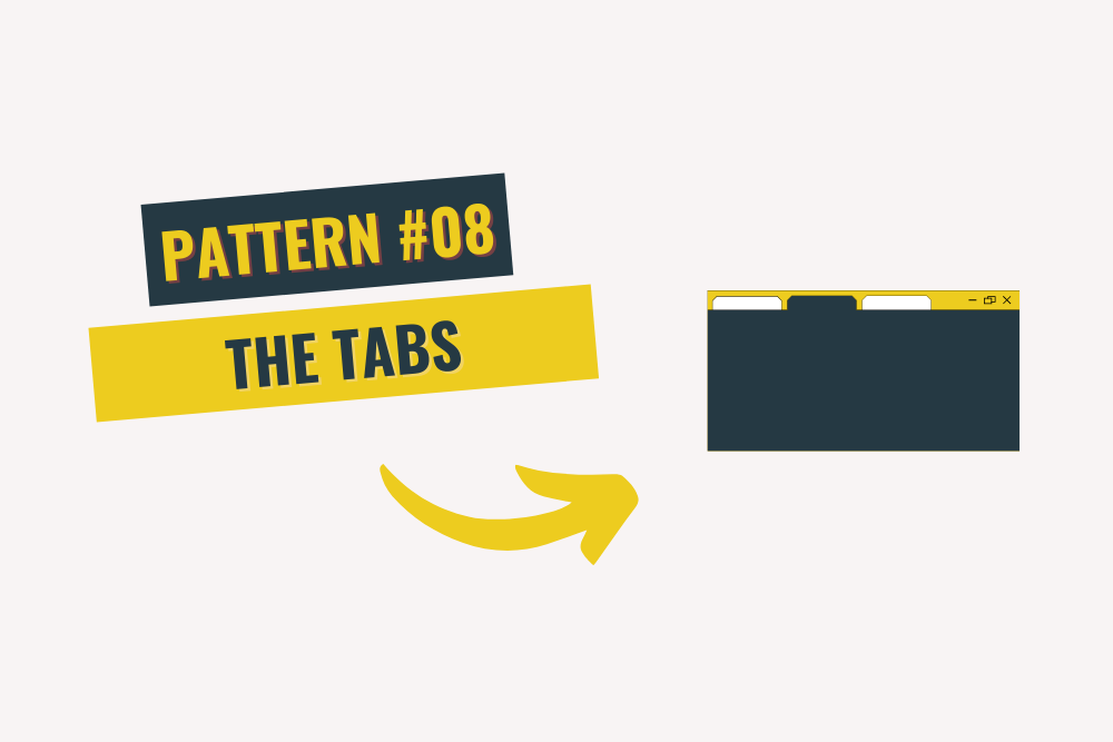
The tabs are a UI design pattern that allows users to navigate between different pieces of content by clicking on tabbed links. This pattern is often used for articles or other pieces of content that are too long to fit on one page. Most eCommerce websites go for this layout because it offers ease of navigation. The user doesn’t have to swap between pages repeatedly.
Tabs are a user-friendly way to navigate between different pieces of content. However, like other patterns, tabs also have some limitations. For example, users can easily lose the item/information they were looking at if they click on the wrong tab. Moreover, while using a website with a ‘tabs’ layout, it can take longer for users to look for their desired content if the content needs more than one page on the site.
Pattern #09: The Tree View
The tree view is a UI design pattern that allows users to navigate a hierarchical structure by expanding and collapsing “nodes.” This pattern is often used for navigation menus or other types of content that can be organized into a hierarchy.
Tree views are popular because they are easy to use and navigate. However, one drawback of this pattern is that clicking on the wrong node will take you someplace else, and it will be hard to find your way back to where you were previously. Another downside is that if the content is heavy and is based on a large tree, users will have a hard time looking for their desired information and content.
Pattern #10: The Accordion
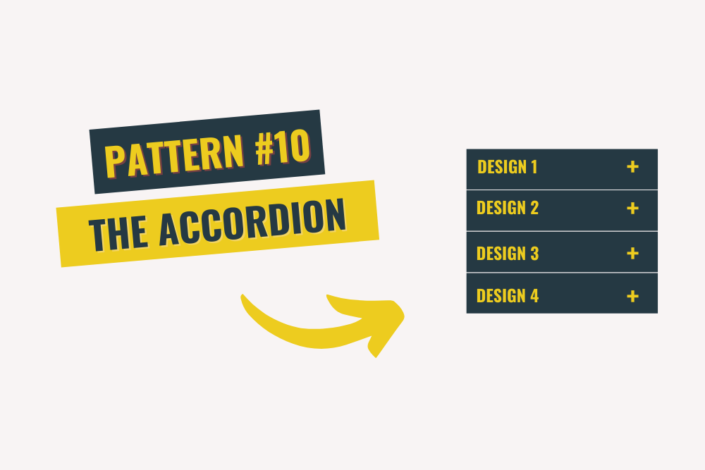
The accordion is a UI design pattern that allows users to navigate a hierarchical structure by expanding and collapsing “panels.” This pattern is often used for navigation menus or other types of content that can be organized into a hierarchy.
Accordions are popular because they are easy to use and navigate. However, the drawback of this pattern is that it can be easy for users to get lost if they click on the wrong panel. In addition to that, it can take longer for users to find what they are looking for if the content is spread out over a large accordion.
The UI design pattern formula
Now that you know the most popular user interface design patterns, it is time to learn how to use them. The key to using these patterns effectively includes assessing and determining the user’s needs and goals. Once you know what the user is trying to accomplish, you can choose the best design pattern to help them achieve their goal.
Here is a quick overview of the steps you will need to take:
- Understand the user’s needs and goals.
- Choose the best design pattern to help the user succeed in finding what they are looking for.
- Implement the design pattern in your user interface
Finally, Test the user interface to ensure its user-friendliness.
By following these steps, you can be sure that you are using user interface design patterns correctly to create a user-friendly interface.
FAQS
What are UX design patterns?
UX design patterns are repeatable hacks and techniques that solve common user experience problems. They are like templates that can be customized to fit the unique needs of a website.
What is the user interface design process?
The user interface design process typically involves four main phases: research, conceptualization, prototyping, and testing. In the research phase, designers collect data about the potential audience and what they are looking for. This data helps inform the design of the user interface in the conceptualization phase.
Once a preliminary design is created, designers create prototypes to test how users interact with the interface. Finally, designers conduct usability tests to assess whether the interface meets users’ needs.
What are the three types of design patterns?
- Creational
- Structural
- Behavioural
Creational patterns are concerned with the process of object creation, whereas structural patterns deal with the composition of objects into structures. Behavioural patterns address communication between objects.
What are the ten rules of good UI design?
- Understand your users
- Respect your users’ time
- Make tasks easy
- Be consistent
- Use feedback to enhance the user experience
- Design for emotion
- Test your designs
- Simplify, simplify, simplify!
- Stabilize the relationship between form and function
- Pay attention to the details
Conclusion
User interface design patterns are a great way to create user-friendly interfaces. By understanding the most popular patterns and how to use them, you can create interfaces that users will love if a user likes your website, which means recurring visits from him and more traffic. A good user experience should be the top priority because, ultimately, his experience with you is what ensures more business.

