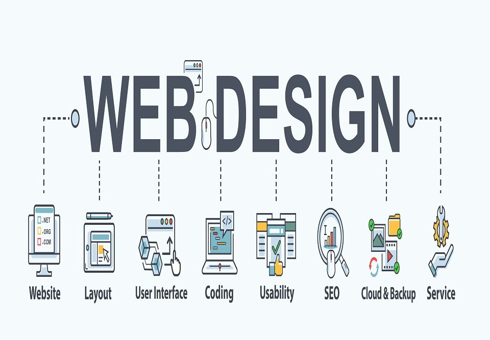
A web design must be enjoyable and useable other than having a good appearance. It implies that a web design combines both aesthetics and usability. So, it means that there is no chance to make any web design mistakes. Unfortunately, sometimes a designer makes some common web design mistakes that make a less worthy website. Therefore, these web design mistakes lead to a loss in business by losing customers.
A simple web design mistake can affect the SEO of the websites as well. Hence, a designer should be very cautious in avoiding minor web design mistakes that adversely affect the website. Let’s learn what these common web design mistakes are that he must avoid for a perfect web design.
Bad Navigation
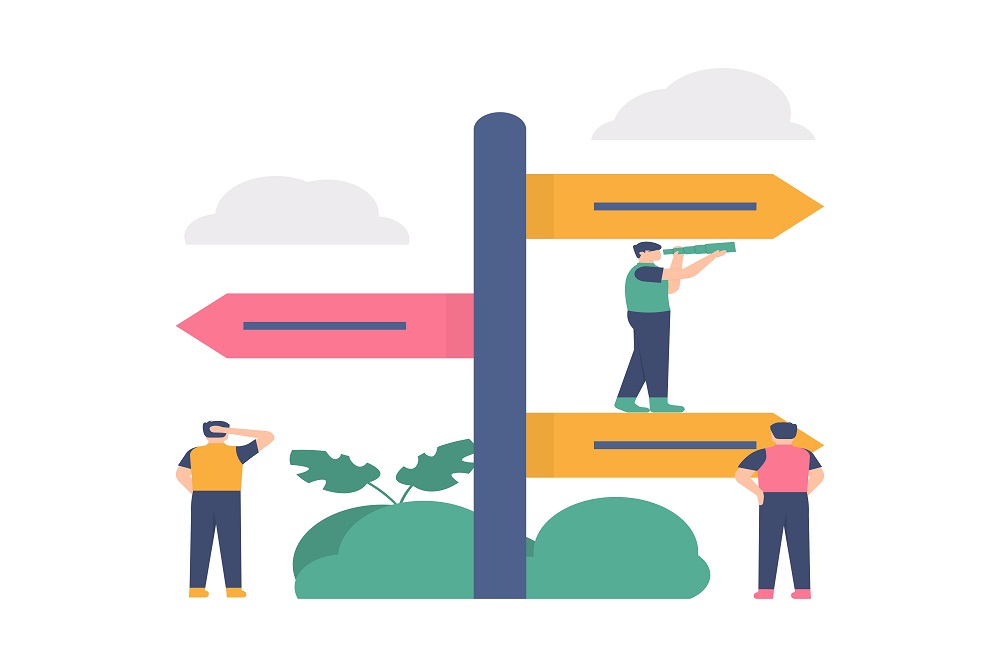
Have you ever clicked a website to open and be like, what? What’s that? You find no hint as to what to do further. It is the time when everything happens instantly. Consequently, if your website takes a long to load or work, it will lead to its closure.
The excellent website navigation makes a user feel easy while moving to other web pages or any part of a site. Unfortunately, it’s a web design mistake that is very dangerous. Therefore, the problems in navigation destroy all its looks as well. The user gets frustrated and decides not to operate further the website.
Slow Speed
If a website is taking more time to load, it will only decrease the performance. So, if it happens, you need to think again about your choice within the elements of the website. People nowadays are very fast in any task. It is a time of rapid actions everywhere. So, today, a website that is fast to load is preferred. Also, this helps to reach the top of search engine ranking. On the contrary, if a site is slow, people will quit it instantly.
They will move to your fast competitor. Google advises that the time to load a website must be in three seconds. So, this web design mistake must not be a problem. A web designer needs to choose elements that take less time to load. Also, he needs to select a theme that is lightweight and easy to load and use. Some of such themes include Astra, Hello Elementor, and OceanWP.
Overloaded Web Design
You went to the market and chose a dress that looks nice. However, you may not prefer to choose a dress with many colours or an overly printed shirt. The same is the case with a website design and website. A website having overloaded things like pop-ups, any ads, plugins have an adverse effect. In addition, disruptive pop-ups interrupt and irritate users a lot. Also, it affects search engine ranking. Thus, a designer must not make this web design mistake.
It also adds a poorly built design that has many colours or elements. A web designer should try to upload minimum things. Plus, a website must include only those elements that are necessary. On the contrary, loading it with poor elements will destroy its look.
Incorrect Typography
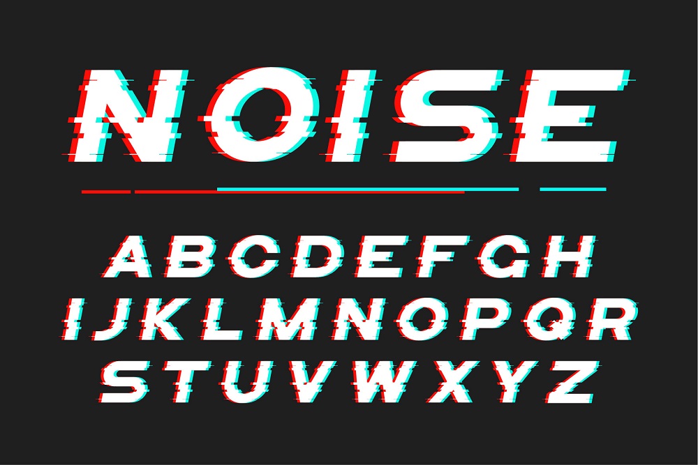
Every business has different ways to attract users, so good fonts that best suit the business niche are essential. The fonts must suit the business niche. Furthermore, the content must be easy to read. Finally, the size of fonts must not be too large or small.
It must be of the appropriate size. The simple strategy for adding an excellent, readable effect is this. Use dark font colours against a light background. On the contrary, use light colours in the font (like white) on the dark backgrounds (like blue).
Inapt Visuals

Attractive images and videos have a more significant impact on users. On the contrary, poor images affect people negatively. Visuals have more impact on people than words. So, anyone must avoid this web design mistake. Other than that, visuals, too, must suit the businesses.
Loading the website with irrelevant visuals only for the sake of attraction also impacts negatively. It makes users confused about your business if the message is not delivered correctly. Thus, it s another common web design mistake that designers do, to make a site look attractive.
Non-Responsive Design

Let’s make you clear first. A responsive design works and fits perfectly on any device. It can be a mobile, desktop, or tablet. The design fix itself to any device maintain the quality of a site. Unfortunately, designers make this web design mistake as well. They prioritize laptops and screens, forgetting the importance of mobile screens.
Today, the use of phones is no doubt more than laptops. Every two out of three minutes online are consumed on mobile phones. So, there are two disadvantages of not having a responsive design. The first is that you will lose customers that are mobile users. Second, you have more risk for the Google penalty. So, if your website doesn’t have a responsive design yet, it’s time to get one.
Wordy Images
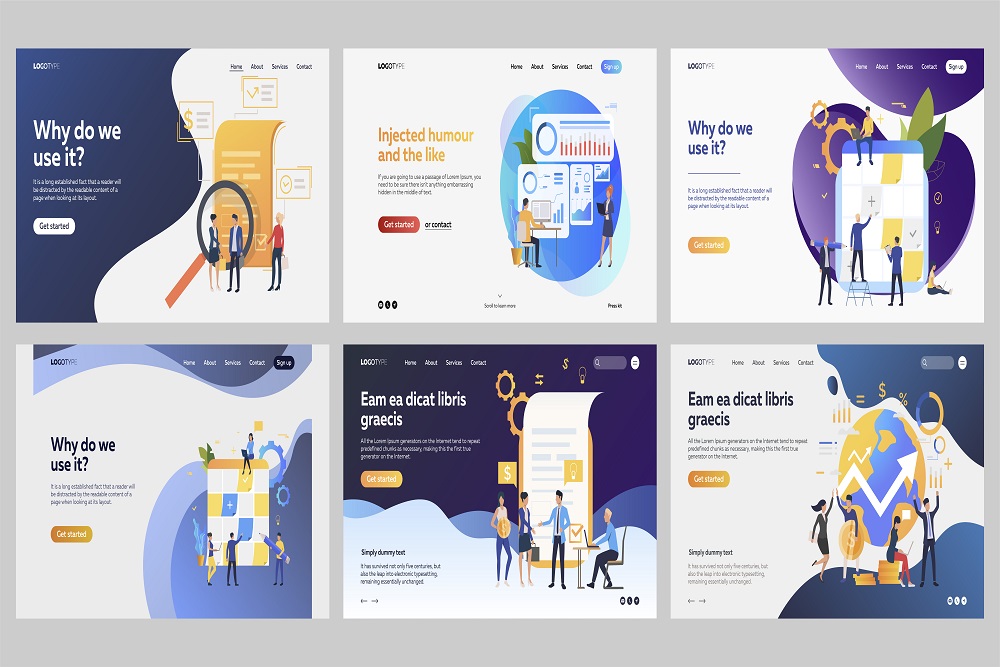
Words placed on images count a lot as it only communicates to the user. It is common among all web design mistakes. Many web designers couldn’t understand this mistake. Yet, it is important. Surprisingly, it is hard to avoid as well. The reason is that it is a need sometimes. Still, one must take care while adding text. It is not over the image but on the image. The issue is that when a designer adds any word directly to an image, you slip the chance to use H1 sub-heading. Importantly, you also miss adding important keywords that are a must. Also, remember that the people who come to your website can read it. Yet, Google cannot.
Absence of H1 Tags
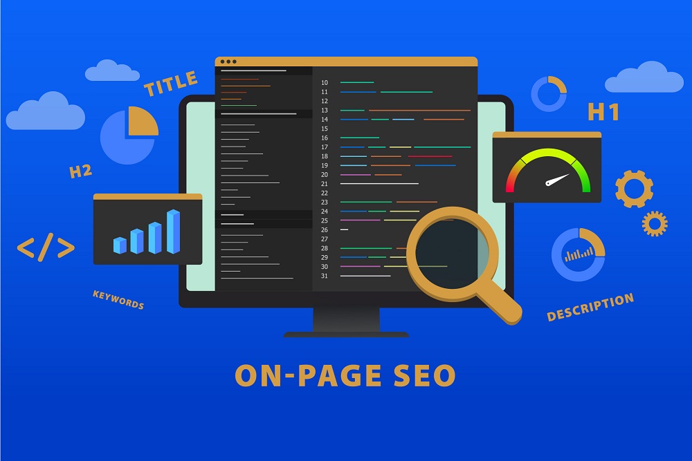
Web design mistakes are those that seem so usual. Have you ever thought about H1 tags? Users, as well as Google, needs to be clear about what the site is all about? Pictures with words help the user understand the website. Also, not using the H1 tag drops a spot from search engine ranking. Remember, H1 tags must have the main keyword. Second, H1 must be on the space that has direct contact with the user’s sight.
To check whether your H1 tag is posted suitable or not, do this. Take a 5 seconds test, and ask someone what the website is all about? If he succeeds, congrats, you have posted it. The message is suitable for people as well as Google.
No Call for Action Button
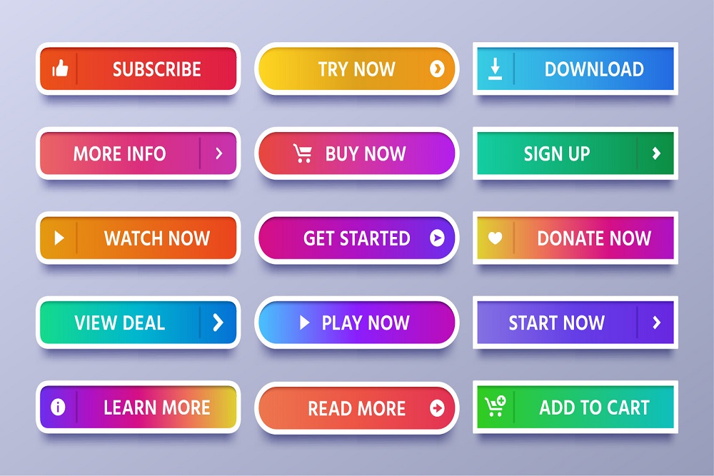
A call of action button is an essential component of a website. A website that doesn’t have a call to action button is a little complicated. It is because we are not helping the user. Instead, he needs to find all the options he wants to see by himself. It is very frustrating for the users. Maybe they will switch to some other site where they can easily find the button. A call to action button is preferred to be present on the landing page. A good web designer fixes this to the website amazingly. Thus, a user may find it cool and use it. To add more info to this, ensure the following
- The call to action button must be engaging.
- It must be easy to spot.
- The size of the call to action button must be big than other words.
- It must be bright or in contrast to another colour.
- It must be somewhere the attention of user reach easily.
Elements with Weak SEO

SEO is an integral part of any website. Yeah, it is part of a site nowadays. Without a good SEO, a website cannot reach many customers or search engine results. A website needs all content, images, themes, and many other elements that are SEO friendly. Unfortunately, sometimes a web designer forgets to add themes or elements that are SEO friendly.
Thus, he only focuses on making the website look good. So, he chooses the best theme and objects. Yet, SEO has its value to take a site on the top of search engine results. Therefore, a designer needs to choose everything based on SEO to be successful. It is because proper spacing and light design theme make a design great for Google and people. Also, it loads fast and gives a good user experience. Hence, designers must avoid this web design mistake to be successful in the web world.
Having a Poor 404 Page
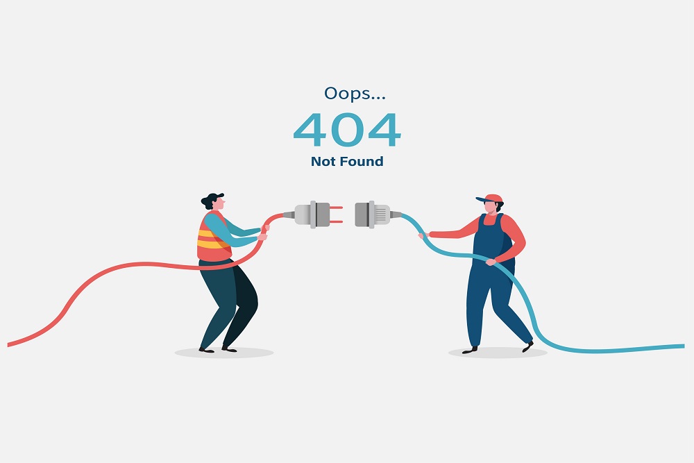
A 404 page is not an option but a must. A good website needs a 404 page. So, what is the designer’s part in it? He needs to design it as well. It means this is a common web design mistake that 404 page has no impact. When a user searches for a thing and can’t find it, he feels annoyed or irritated. In this case, he needs to be guided. A good website makes a user think that it cares for his experience.
So, a 404 page is the best way to show that you care about their experience. Also, by this, you can keep them on the website. Plus, you can help to reach where else they want to on the website. In general, you allow them to move next. On the other hand, 404 pages, without any creativity, feels so dull. The point of not finding what the user wants irritates him. In addition, a boring 404 page frustrates him more.
Yet, with some creativity, you can design it well. Good typography, design and words make a user feel interesting to view. Also, maybe if it is a little funny, it makes them smile. So, they will return to the website or feel delighted by an appealing design.
Conclusion
When the website cannot reach a niche leader’s level, one wonders about the mistake. So, it can be a web design mistake. But, the truth is, sometimes they do not realize these mistakes. In this blog, We have mentioned the most common mistakes that a web designer makes. Thus, find all basic web design mistakes and resolve them beforehand. Also. know what is web design services?
